Online website that promotes The Best of the Best in Arts, News, reviews, updates on Art from around the Globe.
Erosion by Mike Halem
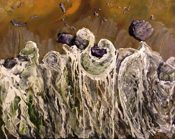
Erosion – Oil on canvas size 24 x 30 inches . Mike Halem
Date: September 2013
LikeLoading...
3 Comments on “Erosion by Mike Halem”
This image has such beauty and harmony yet the impact of a destructive element is present. I am by the erosive energy and the free floating particle set against a fathomless depth of space. This is an excellent piece, different from your other work that I have seen. All of your work has great merit and I thank you for your contribution to this exhibition.
I really appreciate your skill with oil paints and what appears to be texture in the bottom 2/3 of the canvas. If it is not texture then even more praise to you for your intricate brush works. This composition is well balanced. The colors are keyed together which brings a unity to the art work. The upper third of the canvas is warm but appears distant in contrast to the lower part due to the difference in texture/brushwork. I personally, feel the emotion of struggling to reach a goal. The purple rock like sections symbolize overcoming the struggle. Thank you for submitting your art work and I hope to see more!
The refined colour harmony unifies contrasted matters. The choice for a pale moss green for shading fits well to render organic decline. I’m amazed to witness a sublimation, purples ravished in the air escaping from attraction.
I see an opportunity in the foreground to refine volume through shading making it less frontal, but that’s all..
Surprising image indeed, congratulations..



This image has such beauty and harmony yet the impact of a destructive element is present. I am by the erosive energy and the free floating particle set against a fathomless depth of space. This is an excellent piece, different from your other work that I have seen. All of your work has great merit and I thank you for your contribution to this exhibition.
I really appreciate your skill with oil paints and what appears to be texture in the bottom 2/3 of the canvas. If it is not texture then even more praise to you for your intricate brush works. This composition is well balanced. The colors are keyed together which brings a unity to the art work. The upper third of the canvas is warm but appears distant in contrast to the lower part due to the difference in texture/brushwork. I personally, feel the emotion of struggling to reach a goal. The purple rock like sections symbolize overcoming the struggle. Thank you for submitting your art work and I hope to see more!
The refined colour harmony unifies contrasted matters. The choice for a pale moss green for shading fits well to render organic decline. I’m amazed to witness a sublimation, purples ravished in the air escaping from attraction.
I see an opportunity in the foreground to refine volume through shading making it less frontal, but that’s all..
Surprising image indeed, congratulations..